The WordPress Button Component is very versatile, so I thought I’d show you some ways I have used it throughout my code.
Let’s start with some examples and work backward regarding attributes and props.
Example 1: Turn off preview mode in QuotesDLX

I added a link in the sidebar options of the Block Editor so that I could disable a preview mode that I have as a plugin feature.
const previewBlockInspectorControls = (
	<>
		<PanelBody
			initialOpen={ true }
			title={ __( 'Preview Mode Active', 'quotes-dlx' ) }
		>
			<Button
				variant="link"
				onClick={ ( e ) => {
					setAttributes( { preview: false } );
				} }
			>
				{ __( 'Turn Preview Mode Off', 'quotes-dlx' ) }
			</Button>
		</PanelBody>
	</>
);
Code language: JavaScript (javascript)
Let’s go over the highlighted attributes.
The variant attribute
The variant attribute (non-required) is what the button’s style should be.
The variant attribute’s value can be:
- primary
- secondary
- tertiary
- link
If you’re using the Block Editor, all of these variant styles will be styled for you. In the above example, I used “link” as my variant value so that the button would look like a link.
The onClick Attribute
The onClick attribute is just so you can capture when a button has been clicked. It is required to pass in this attribute.
<Button
	variant="link"
	onClick={ ( e ) => {
		setAttributes( { preview: false } );
	} }
>
	{ __( 'Turn Preview Mode Off', 'quotes-dlx' ) }
</Button>
Code language: JavaScript (javascript)
In this callback, I just set a preview block attribute to false.
Example 2: Add a group of alignment buttons to a React admin
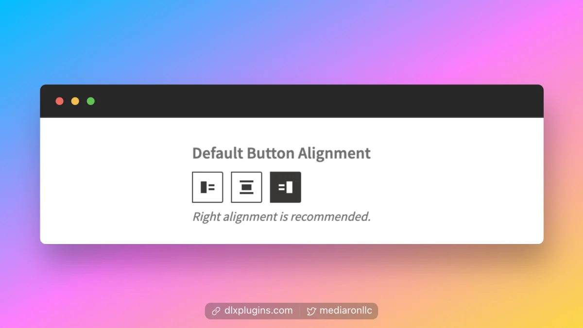
In my WordPress projects, I stick with WordPress components. So when I coded an admin panel in React, using WP components was a foregone conclusion.
In this example, I add a group of buttons that will offer alignment options.
<Controller
	name="tweetButtonAlignment"
	control={ control }
	render={ ( { field: { onClick, value } } ) => (
		<ButtonGroup className="qdlx-admin__button-group--align">
			<label>
				{ __( 'Default Button Alignment', 'quotes-dlx' ) }
			</label>
			<Button
				variant="primary"
				icon="align-pull-left"
				label={ __( 'Align Left', 'quotes-dlx' ) }
				title={ __( 'Align Left', 'quotes-dlx' ) }
				className={ classNames( {
					'is-active': 'left' === value,
				} ) }
				onClick={ ( e ) => {
					setValue( 'tweetButtonAlignment', 'left', {
						shouldDirty: true,
					} );
				} }
			/>
			<Button
				variant="primary"
				icon="align-center"
				label={ __( 'Align Center', 'quotes-dlx' ) }
				title={ __( 'Align Center', 'quotes-dlx' ) }
				className={ classNames( {
					'is-active': 'center' === value,
				} ) }
				onClick={ ( e ) => {
					setValue( 'tweetButtonAlignment', 'center', {
						shouldDirty: true,
					} );
				} }
			/>
			<Button
				variant="primary"
				icon="align-pull-right"
				label={ __( 'Align Right', 'quotes-dlx' ) }
				title={ __( 'Align Right', 'quotes-dlx' ) }
				className={ classNames( {
					'is-active': 'right' === value,
				} ) }
				onClick={ ( e ) => {
					setValue( 'tweetButtonAlignment', 'right', {
						shouldDirty: true,
					} );
				} }
			/>
			<p className="components-base-control__help">
				{ __(
					'Right alignment is recommended.',
					'quotes-dlx'
				) }
			</p>
		</ButtonGroup>
	) }
/>
Code language: JavaScript (javascript)
There’s a bit going on here, but there are three Button components within a ButtonGroup component just to make things a bit cleaner.
Let’s look at one of the buttons:
<Button
	variant="primary"
	icon="align-pull-left"
	label={ __( 'Align Left', 'quotes-dlx' ) }
	title={ __( 'Align Left', 'quotes-dlx' ) }
	className={ classNames( {
		'is-active': 'left' === value,
	} ) }
	onClick={ ( e ) => {
		setValue( 'tweetButtonAlignment', 'left', {
			shouldDirty: true,
		} );
	} }
/>Code language: JavaScript (javascript)
The variant attribute
variant="primary"Code language: JavaScript (javascript)All three buttons are set as primary. I didn’t use the variant attribute here for any style purposes. Instead, I used classes.
The icon attribute
icon="align-pull-left"Code language: JavaScript (javascript)A benefit of using WordPress components in the admin is the presence of dashicons. And with the icon attribute, you can use any of the dashicons in your components.
I set the icon attribute to “align-pull-left”, which corresponds to this dashicon:

You can also pass icon an SVG component for custom icons.
The label attribute
label={ __( 'Align Left', 'quotes-dlx' ) }Code language: JavaScript (javascript)The label attribute provides the aria-label of the button for accessibility. Since I have tooltips enabled, the label also acts as my tooltip text.
The label is not the button text and you can have an icon-only button by providing no children to the button component.
The title attribute
title={ __( 'Align Left', 'quotes-dlx' ) }Code language: JavaScript (javascript)The title attribute just sets the HTML label title attribute. This provides a form of a tooltip when you hover over a button.
The className attribute
className={ classNames( {
    'is-active': 'left' === value,
} ) }Code language: JavaScript (javascript)
className is a normal react attribute for setting CSS classes for a component. I’m using the react library classnames to dynamically set a CSS class.
Example 3: Show Loading State
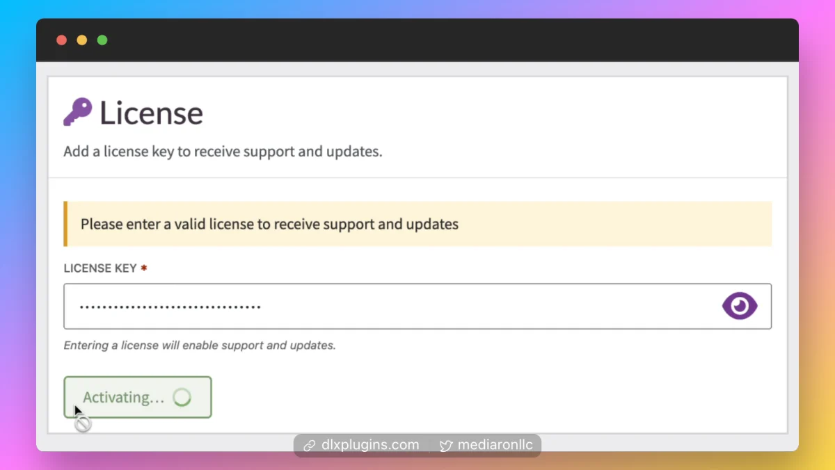
I needed a button for a license activation screen. I made the decision to show the loading or “saving” state on the button itself.
return (
	<>
		<Button
			className={ classNames(
				'qdlx__btn qdlx__btn-primary qdlx__btn--icon-right',
				{ 'has-error': hasErrors() },
				{ 'has-icon': saving },
				{ 'is-saving': { saving } }
			) }
			type="submit"
			text={ saving ? saveTextLoading : saveText }
			icon={ saving ? Spinner : false }
			iconSize="18"
			iconPosition="right"
			disabled={ saving || revokingLicense }
		/>
	</>
);Code language: JavaScript (javascript)
The type attribute
type="submit"
Code language: JavaScript (javascript)
This is just a normal input type. Since my button acts as a submit button, I give it the type of submit.
The text attribute
text={ saving ? saveTextLoading : saveText }Code language: JavaScript (javascript)The text attribute will assign the text of the button. In the above snippet, I have a saving state, and the text of the button changes if someone submits the form.
The icon attribute
icon={ saving ? Spinner : false }Code language: JavaScript (javascript)In this particular case, I’m showing an icon (a loading icon) only when the form is being saved/submitted.
The iconSize attribute
iconSize="18"Code language: JavaScript (javascript)The iconSize attribute dictates the size of the icon.
The iconPosition attribute
iconPosition="right"Code language: JavaScript (javascript)The iconPosition attribute allows for aligning the icon within the button. You can align it left or right.
The disabled attribute
disabled={ saving || revokingLicense }Code language: JavaScript (javascript)I set up a condition so that the button would be disabled if a form was being saved or a reset occurred.
Example 4: Buttons as Options
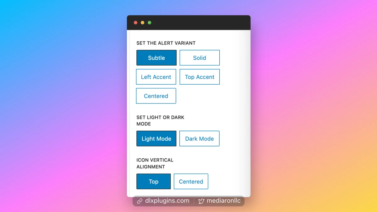
To mimic block patterns a bit, I decided to include buttons that acted as radio buttons when selected in the block editor.
<PanelRow>
	<BaseControl id="alerts-dlx-variants-button-group" label={ __( 'Set the Alert Variant', 'quotes-dlx' ) } className="alerts-dlx-chakra-variants">
		<ButtonGroup>
			<Button
				variant={ variant === 'subtle' ? 'primary' : 'secondary' }
				onClick={ ( e ) => {
					setAttributes( {
						variant: 'subtle',
					} );
				} }
			>
				{ __( 'Subtle', 'alerts-dlx' ) }
			</Button>
			<Button
				variant={ variant === 'solid' ? 'primary' : 'secondary' }
				onClick={ ( e ) => {
					setAttributes( {
						variant: 'solid',
					} );
				} }
			>
				{ __( 'Solid', 'alerts-dlx' ) }
			</Button>
			<Button
				variant={ variant === 'left-accent' ? 'primary' : 'secondary' }
				onClick={ ( e ) => {
					setAttributes( {
						variant: 'left-accent',
					} );
				} }
			>
				{ __( 'Left Accent', 'alerts-dlx' ) }
			</Button>
			<Button
				variant={ variant === 'top-accent' ? 'primary' : 'secondary' }
				onClick={ ( e ) => {
					setAttributes( {
						variant: 'top-accent',
					} );
				} }
			>
				{ __( 'Top Accent', 'alerts-dlx' ) }
			</Button>
			<Button
				variant={ variant === 'centered' ? 'primary' : 'secondary' }
				onClick={ ( e ) => {
					setAttributes( {
						variant: 'centered',
					} );
				} }
			>
				{ __( 'Centered', 'alerts-dlx' ) }
			</Button>
		</ButtonGroup>
	</BaseControl>
</PanelRow>Code language: JavaScript (javascript)
The only attribute worth mentioning here is variant. Since we’re in the block editor for this snippet, WP styles are present. I just test a variant attribute and set the button as primary only when the correct variant is present.
Conclusion
I gave four examples of how I have used the Button component. If this was useful for you, please let me know in the comments.

Ronald Huereca founded DLX Plugins in 2022 with the goal of providing deluxe plugins available for download. Find out more about DLX Plugins, check out some tutorials, and check out our plugins.